


-
Preparing for Isaias with a Great Global Model
Posted on July 31st, 2020 No commentsThis morning’s MARACOOS operations meeting focused on the final preparations before the forecast passage of Hurricane Isaias. Here is a quick update on the operational models they support.
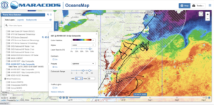
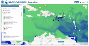
First is a 3 day composite satellite sea surface temperature map of the Mid Atlantic generated by Matt Oliver with the underwater glider tracks in black and the forecast track (black) and cone (white) of Isaias plotted on top. The color bar on the SST is adjusted to highlight temperatures from 18C to 30C. We see the warm Gulf Stream offshore with Robert Todd’s gliders in them. The cluster of NSF OOI gliders south of Cape Cod that are in that cold water that is advecting south along the shelf break, and the MARACOOS and Navy gliders on the shelf mapping the bottom cold pool that lies below the very warm shelf surface water – nearly as warm as the Gulf Stream.
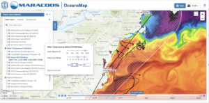
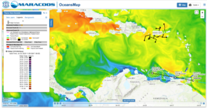
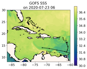
First we look at the Navy Global Ocean Forecast System (GOFS) from the top. Here we plot SST from GOFS using the same color scale as above. Se see the warm Gulf Stream Offshore. The advection of the cold surface water through the NSF OOI array. And the warm surface water over the shelf.
But what is happening below the surface? Is GOFS, the start of our data assimilative value chain, getting the Mid Atlantic’s Cold Pool?
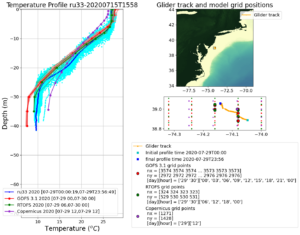
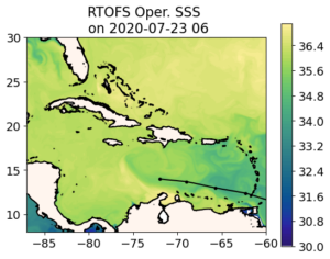
Here is one of those glider data/model comparisons that Maria generates every day. Blue is the data from the glider, with light blue being all the profiles and dark blue being the average. Red is the Navy GOFS, start of the ocean component of the hurricane forecast value chain. The surface temperature is spot on. The thermocline is spot on. Bottom temperature is close. The European model is a little cooler at the top and warmer at the bottom, which reduces the slope and therefore the stratification. Getting the shelf response right is all about the stratification. Then in green is the NOAA ROTFS model, next step in the hurricane value chain where the NOAA winds are layered on. The surface temperature is right. The surface mixed layer temperature is right. The slope of the temperature change in the thermocline is right. The bottom temperature is right. And this is from a suite of global models – informed by local data.
Results like this have been a long time in the making. In the Mid-Atlantic, in MARACOOS, and in our Universities with our students, we have been working this issue since the back to back impact years of Irene and Sandy. It represents the persistent efforts of our dedicated field crews that work to maintain our observation network, our modelers for ROMS and WRF, and our data managers up at RPS in Rhode Island that keep OceansMap working every day. It is the work of our many glider partners from the people that make the gliders at TWR in Massachusetts, to the people that fly them, to the people that manage the data at the US IOOS Glider DAC, the pilots at the Navy GOC, to the people at NDBC that send the data off through the GTS, and to the people that pull it out of the data tanks and into their operational models. It is the work of the Navy modelers at NRL Stennis that spent countless hours helping us track the data through the assimilation system, and the NOAA modelers at NCEP that keep RTOFS running and answer our many, many questions about the operational system, especially our good friends Hyun Sook and Zulema who work with Maria everyday. To our partners in research at AOML, and across the IOOS Regional Associations along the hurricane pathways – together we have defined the Essential Ocean Features that impact hurricane intensity in our regions, and together with IOOS, OAR, Navy, NSF, the universities, the energy industry, and the glider manufacturers, we have assembled the hurricane glider picket line that monitors those features and protects our nation’s coasts like the soccer goalie protects the goal. Literally the work of hundreds of people going into what is summarized above in 3 simple plots – the Mid Atlantic is Ready.
Bravo Zulu.
Force, wind and honor.
Work hard, have fun, change the world.
They all apply. We are getting the job done.
Happy Friday All.
-
One Ocean for Potential TS Nine
Posted on July 28th, 2020 No commentsIn terms of the ocean, we have never been more ready. Potential Tropical Storm Nine is crossing over the same ocean in all the forecast models.
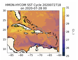
Here is SST from HMON’s HYCOM. This is part of the global GOFS to global RTOFS to regional HYCOM value chain.
We see the same features we talked about in the morning blog on the global models.
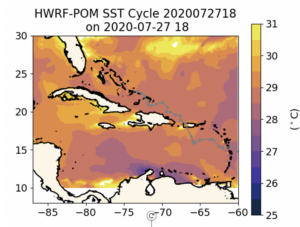
Here is the SST from HWRF that is coupled to MPIPOM. Focus on the Caribbean and along the track of the storm. The features are nearly the same. The cold water upwelled along the coast of South America is being advected around the Caribbean-wide anticyclonic feature south of Hispaniola in HMON and HWRF. The warmest water is up by Puerto Rico where AOML has the densest part of glider picket line in place well in advance. We saw in the morning blog that within that region covered by the gliders, the global models are all in really good agreement, telling us that even the different assimilation schemes appear to be bringing us closer together. The temperature ranges are so similar in these plots. All the US models are lining up in agreement on the basic Essential Ocean Features and temperature range before the storm, with the European Copernicus now representing a similarly structured but slightly warmer version of the ocean.
Much more to look at tonight. But from this initial look at the ocean side, we can’t be more ready.
-
Preparing for Potential TC Nine
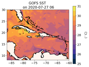
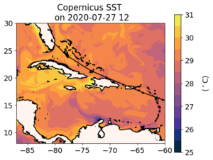
Posted on July 28th, 2020 No commentsNHC 11 am message renamed the disturbance Potential Tropical Cyclone Nine. Prompts us to do a quick tour of the data assimilative global models, Navy GOFS and European Copernicus.
First is GOFS SST, and below it Copernicus SST. Maria has made these new plots easier to interpret. Colors are now in 0.5C increments, with the range tuned to each region. First impression is that Copernicus warmer than GOFS, often by about 0.5 C.
Now for the surface salinity as a proxy look at the barrier layers. Copernicus is generally fresher, possibility with more substantial barrier layers.
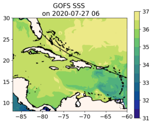
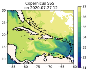
Warmer Sea Surface Temperature (SST) and lower sea surface salinity (SSS) in Copernicus mean more potential for intensification with the Copernicus ocean.
-
Preparing for Disturbance 1
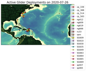
Posted on July 27th, 2020 No commentsDisturbance 1 is heading toward the Lesser Antilles. Just beyond this line of islands is Puerto Rico, surrounded by the extensive AOML glider fleet. I’ll start with one quick comparison tonight. You only need to look once, the result is the same for glider after glider. The data assimilative models are doing really well.
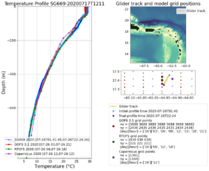
I’ll show glider SG699, the most forward glider in the array, on the southeast corner. First plot is the temperature profile. All three global models are in amazing agreement. It gives us a lot of confidence when all the models agree, that the sensitivities to the different methods of assimilation are small compared to the value added by the data.
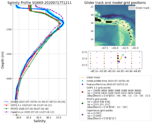
Next is salinity. Again, very good agreement through most of the water column. The important features are the subsurface peak in salinity about 180 m deep, and how the salinity then decreases as you approach the surface. The exciting thing here is that the global models all have a low salinity barrier layer. There are some differences between the model and the salinity data. The barrier layer is thinner and less salty in the data. Depth of the barrier layer looks to be more tied to the temperature profile in the model. But looking from the perspective of a global model informed by local data, this is really good.
If you click on the other automated model/glider comparison plots Maria posts
https://rucool.marine.rutgers.edu/hurricane/Hurricane_season_2020/
you will see similarly good agreement between the glider data and the models for multiple gliders. Looks like all the pieces are working together, with the glider data ensuring that the global models have time to be on track well before the storm hits. This is the plan in action.
Now that we know the global models are doing a fairly good job of including the barriers layers at least where we have data to assimilate, let’s take a look at the spatial distribution of sea surface salinity from the Navy GOFS model. In the OceansMap layer below, we use a salinity color scale from blue (33) to green (36). The plume of the Amazon and Orinoco rivers make it through the passages between the Windward Islands, especially by South America, remaining relatively fresh heading northwest towards Puerto Rico. South of Hispaniola you see the Caribbean-wide mesoscale feature wrapping fresh water around itself. Looking back at Puerto Rico, you can see why glider SG699 is a bit more salty than the observations. There are some small submesoscale features in the model just South of St. Croix. Looking at the profiles above tends to push you towards invoking vertical processes to explain the differences in barrier layer salinity, but the maps tend to lean you towards small scale horizontal processes being something to consider. Also remember, these are global ocean models, the smaller scale horizontal processes are supposed to be cleaned up by the higher resolution nested regional ocean models. Bottom line, from what we can see, we have the global model ocean in pretty good shape in the area near Puerto Rico well before the tropical disturbance arrives.
-
Saturday Morning MARACOOS OceansMap Hurricane Figure Contest Winner
Posted on July 25th, 2020 No commentsIts close enough to noon that we can declare Doug Wilson’s – from Ocean and Coastal Observing – Virgin Islands (OCO-VI) – contribution the winning hurricane figure of the morning. It is a figure produced from MARACOOS OceansMap that plots the sea surface temperature from the Navy Global Ocean Forecast System (a HYCOM based model, hence the name in OceansMap, Navy HYCOM) in the Caribbean, with the temperatures enhanced to highlight the coastal upwelling along South America. The more southerly track of Gonzalo is going right over the colder water. Another important feature of the adjustable scales is that ability to highlight specific features, like that anticyclonic eddy south of Hispaniola that is not in MPIPOM. This is an area begging for an Argo float comparison. Something we can check into next week.
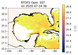
To not leave Hanna out of the mix, here is a similar plot for the Gulf of Mexico. Here I adjusted the temperature scale so that it ranges from 25 to 32. Our automated plots made overnight give us the ability to quickly browse for interesting subjects. Then OceansMap enables the deep dive. Again we have a story of coastal upwelling, both in front of Hanna, and very much along the Yucatan shelf. You can see the cold upwelled Yucatan shelf water being pulled north along the Loop Current. I wonder if images like this would help the NHC forecasts that have to define the edge of the Loop Current for the MPIPOM feature model initialization. Maybe we can talk to them more about how they do that. Another interesting feature is the Anticyclonic Eddy just north of Yucatan that was featured in the TS Cristobal blogs. You can see this eddy has continued to propagate westward since Cristobal crossed directly over it along 90W. Recall that this eddy is not in the MPIPOM model for Cristobal, since it needs to be inserted through the warm eddy feature model.
-
Hurricane Hanna
Posted on July 25th, 2020 No commentsHanna is forecast to become a hurricane today as it approaches landfall. Lets look at the ocean’s Sea Surface Temperature (SST) in the 3 global models beneath Hanna.
Keeping with the “It starts with us” tradition, here is the Navy Global Ocean Forecast System (GOFS 3.1). The track of Hanna is shown as the black line with the eye location dots approaching the Texas coast in the western Gulf. The SST is very warm, so warm it goes off of our standard scale and turns white for above 30C. In this region, forecasters often look to see if the surface temperature is above 26C for a quick assessment of how much the ocean supports intensification. Looks like it does. Hanna is currently over the warmest water, and that water cools down to the 28C range as it approaches shore. Note that the cooling down goes to 28C, which is still above the 26C diagnostic.
Now lets move to GOFS descendent RTOFS. Recall that RTOFS backs up two days into GOFS to get its initial conditions, giving up 2 days of data assimilation in favor of getting the NOAA global windfields over the ocean. The fields are nearly identical, with a slight shift of the over 30C water south along the Texas coast and east along the Yucatan coast. In this case, the warm water extending beyond our color bar turns into an unexpected benefit.
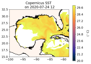
Now on to the European model. The western Gulf looks similar to GOFS – both are assimilating the same satellite SST data and SST dominates at the surface. Details differ, and offer room for investigation. But what really catches my eye is the western Caribbean where we see warming in the progression of models from GOFS to RTOFS to Copernicus. This area of the Caribbean between the Nicaraguan Bank and the Yucatan Strait between Mexico and Cuba is on the hurricane pathway into the Gulf of Mexico. The fresh water barrier layers we find so important east of the Nicaraguan Bank appear to be absent in this region.
At some point I hope to add similar snapshots of the ocean under the operational hurricane models, the regional HMON and HWRF. HMON uses the regional HYCOM derived from RTOFS. It is the endpoint in the GOFS to ROTFS to HYCOM value chain. We can already imagine what the regional HYCOM will look like, similar to the models from which it is derived. But operational HWRF is coupled to MPIPOM which uses a different value chain to get its initial condition. So the critical step here is getting MPIPOM, but this still requires human intervention. Access to the global models is public, and is easily automated so our model/data comparisons run in the middle of the night while we sleep. The operational models are where they should be, protected behind the firewall. This is one reason why the ocean community is looking forward to the new, more open, Hurricane Analysis and Forecast System (HAFS). The first model scheduled to move into the HAFS environment is HWRF. Which ocean is coupled to the version of HWRF that will someday be in HAFS is of high interest.
-
Barrier Layers south of Puerto Rico
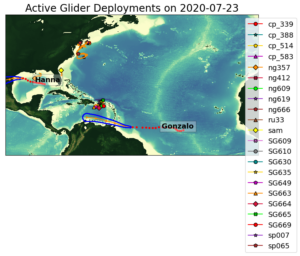
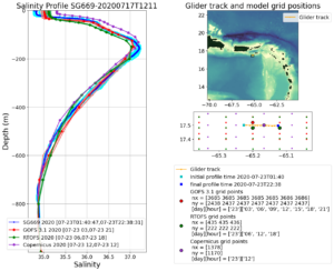
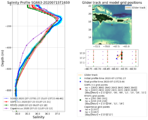
Posted on July 24th, 2020 No commentsThe map below shows where we have the gliders deployed, and where the hurricanes are going. This entry is going to look at the gliders north of Gonzalo’s track. This is where we noted the biggest difference in the sea surface salinity between the Navy GOFS model and the European Copernicus model. We are going to look at 3 gliders south of Puerto Rico, and compare it to the features we see in the GOFS and European models. We’ll look at SeaGlider SG663 (orange triangle on the far west), SG664 (red diamond in the middle), and SG669 (red circle in the middle).
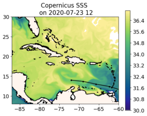
Remember the European model from the last blog. South of Hispaniola, the water is very salty. South of Puerto Rico, the water is very fresh. Over by St. Croix we have salt water entering through the Anegoda passage.
As noted in the previous blog, when we compare the GOFS (and its descendants) to Copernicus, we are looking at two already very good representations of the global ocean, and we are debating the relative merits of different approaches, often in the area of data assimilation. So fo easy reference I am adding below the Navy GOFS surface salinity as the start of the hurricane ocean forecast value chain. As the Naval Oceanographic Command likes to say, “It starts with us”.
Now we will look at the three most southern gliders in the Hurricane Glider Picket Line.
We start with the eastern most glider over by St Croix, where the European model has the transport of salty water in through the Anegoda Passage. Getting the transport through the Anegoda passage in the global models is not easy, as we saw in 2018, when the global model transport through the passage was opposite of the transport observed by an array of 3 Navy gliders (thanks to the Naval Oceanographic Command for supporting their scientists) .
Here is the salinity profile for glider SG669. Blue is the salinity profile from the glider. Red is the data assimilative GOFS. Green is its descendent RTOFS. Purple is the European Copernicus. My first impression is wow, we have some pretty awesome data assimilative global models out there. The overall structure of the water column for salinity is right, enabling us to move onto the more important discussions on the details of the ocean features and their evolution. Our feature of interest is the surface freshwater barrier layers, since the barrier layers inhibit mixing and that has the potential to increase hurricane intensity. At the surface we are seeing an observed ocean that is fresher than all the models. This prompts the question, what is causing the difference, should our our models be transporting the salty water in through the Anegoda, or the freshwater out through the Anegoda, or do we just have salinity randomly wrong? The quality of the model-data fit below leads me to believe it is a good time to look at transports through the passages, one of our hurricane Essential Ocean Features. This is why we placed the triangular array of three Navy gliders in the Anegoda passage in 2018, to diagnose what was going on, and how we were doing. And this is why RU29 will be heading back to the Anegoda later this summer equipped with an current profiler so that it can get simultaneous temperature, salinity and current profiles, enabling us to look at the transports of mass, heat, and fresh water in the various layers to see specifically what we can fix in these models to improve the transports. Some of that improvement may be achieved when we go to the regional scale models with the better resolution. Some may be through improved data assimilation.
Now we move to SG663, south of Hispaniola, in what Copernicus thinks is the very salty water surface water compared to GOFS. Here the European model gets the salty surface water very well. By the time it makes it down to the RTOFS model the surface salinity is about 0.5 units too fresh. But what is going on with the European model at a depth between 200 m and 600 m. The salinity profile in this region is too low. If this was a temperature profile, the first place I would look is in how the satellite altimetry is assimilated. For temperature, the surface is usually kept on track by the satellite SST, the very deep water is kept on track by the global Argo program, and this middle depth between the two can often be traced to the mesoscale variability that is dominated by the assimilation of satellite altimetry. Unlike the surface barrier layers were T-S relationships lose their value, the T-S relationships in this middle depth work very well. This one reason why the Navy’s method of satellite altimetry data assimilation through the Improved Synthetic Ocean Profile (ISOP) method looks so good in this middle region. And this is why we are prioritizing the model-glider data comparisons in this middle region for the new RTOFS-DA system as it comes on line this summer. One of the differences between the data assimilation in GOFS and ROTFS-DA is how the altimetry is assimilated. This is part of the water column is where we will see those differences play out.
Now lets look south of Puerto Rico in the fresh water. South of Puerto Rico, the NOAA RTOFS model gets the surface salinity right on. We are in the middle of the AOML glider array, so we are seeing the value. The gliders do two things really, really well – sharpen the mesoscale – that mid-depth range we just talked about, and resolve both temperature and salinity in the surface waters where T-S relationships are not going to help. Altimetry data is global, but is relatively sparse in time and space. A well designed Glider array is regional, not global, but is relatively intense in time and space. The two are complimentary.

-
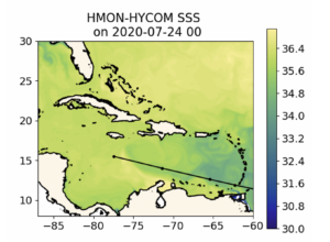
Gonzalo over the Amazon-Orinoco Plume
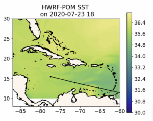
Posted on July 24th, 2020 No commentsBelow we have the forecast track of Gonzalo across the Windward Islands and along the strong southern edge of the Amazon and Orinoco River plume. We look at how the fresh water from these river plumes is distributed in 3 operational global ocean models (GOFS, ROTFS and Copernicus) and the 2 operational hurricane models (HMON and HWRF).
First model is Navy Global Ocean Forecast System (GOFS 3.1). The forecast track of Gonzalo is black line with the dots at the forecast locations. A rare southern track along the Caribbean Corridor. The map is of the surface salinity. The plume meanders along the north coast of South American and then is wrapped around an anticyclonic (clockwise rotating) eddy just south of Hispaniola. The eddy covers the entire width of the Caribbean, so it is hard for a hurricane to miss it, and the anticyclonic motion means it has deep warm pool. Fresh water from the river plumes in the surface barrier layers further inhibit mixing by the hurricane as it passes over, reducing the amount of ocean cooling, which can effect intensity. Also not that the fresh water plume signal disappears about the location of the Nicaraguan Bank that runs from Nicaragua to Jamaica and on to Hispaniola. This structure for the freshwater is very similar to what Doug Wilson found in the climatology.
Now on to the NOAA Real Time Ocean Forecast System (RTOFS). Not much difference. RTOFS is derived from GOFS 3.1. The process was described in an earlier blog. Navy GOFS assimilates all the ocean data up to today, then RTOFS looks back 2 days in the GOFS model, pulls the 3-D GOFS fields as an initial condition, and the moves back up to the present and into the future with NOAA winds replacing the Navy winds. The trade off between 2 days of winds versus 2 days of assimilation looks less significant at this scale. RTOFS and GOFS SSS look about the same in terms of the features of interest, in this case, the location of the plumes.
Now for the 3rd ocean model, the global European model in the Copernicus System. Now we see a much bigger difference. In particular, a much fresher Amazon-Orinoco Plume. The fresh water under the track of Gonzalo if fresher in the European model, and resulting a a more pronounced signature for the anticyclonic eddy. Maybe even more significantly, looking just west of the Windward Islands, in the place where AOML has the many gliders deployed around Puerto Rico, the European model is much fresher. This is something we can check out with the gliders. Which global model is doing better with the salinity of the barrier layers south of Puerto Rico.
.Now we look at the regional ocean in the first operational hurricane model, HMON. This hurricane model is coupled to a regional version of HYCOM that gets its initial condition by pulling the 3-D fields from RTOFS. So it looks very much like RTOFS, which looks very much like the data assimilative Navy GOFS. All the same comments apply. Gonzalo is forecast to travel over the strong southern edge of the Amazon-Orinoco plume and eventually cross the warm eddy.
.
Lastly we look at HWRF. HWRF ins coupled to a regional version of the MPIPOM model that gets its initial condition from climatology modified by feature models for the Loop Current, the Gulf Stream, and some of the eddies. It appears that there is no anticylconic eddy added to the ocean model south of Hispaniola, and the Amazon-Orinoco plume is represented by climatology. This is a very different ocean. When we look at the differences between Navy GOFS (and RTOFS and HYCOM under HMON) with European Copernicus, we are debating the relative strength of the Essential Ocean Features like eddies and river plumes, and how different data assimilation schemes result in changes to these features. When we compare to MPIPOM under HWRF, we are debating if the same Essential Ocean Features even exist in the eyes of the hurricane.
-
Currents from Atlantic Shores
Posted on July 14th, 2020 No commentsNow we look more into the why question. We know the surface water cooled significantly during Fay (5-6C), and we know that 70-90% of the cooling was ahead of eye, and that the ahead of eye ocean cooling changed the sign of the air-sea heat flux. But why?
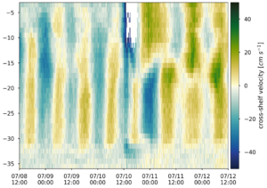
Here Cliff looked more deeply at the currents measured by an Acoustic Doppler Current Profiler (ADCP) on the Atlantic Shores buoy. In the plot below, we rotate the currents into the cross-shore and along-shore framework, and here plot the cross-shore component. Blue represents strong currents towards the coast, green represents strong currents towards the offshore. The y-axis is the water depth of each ADCP data bin in meters.
You can see the storm take over on July 10 after about 12 GMT. There is a very strong jet towards the coast. So strong it maxed out the 50 cm/sec range on the current measurements. Before and after, especially in the bottom layer, you see the 12 hour 25 minute tidal signals.
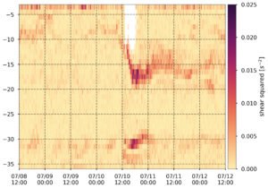
Next we look at the shear squared also plotted as a function of depth. During the storm, the surface mixed layer is expected to have very little shear, being well mixed, and most of the shear will be concentrated across the thermocline. What lights up the image below is the very strong shear layer deepening from 10 m to 17 m ahead of eye. Strong shear across the thermocline causes the familiar Kelvin Helmholtz rolls that act to broaden the thermocline. Large Eddy Simulation (LES) modeling (thank you Cliff and Dan, paper submitted) indicates that the tops of the Kelvin Helmholtz rolls are harvested by the intense mixing in the upper layer, cooling the upper mixed layer and deepening the upper mixed layer. Looks like we are again seeing shear induced mixing across the thermocline resulting in a deeper and cooler mixed layer.
Thanks Atlantic Shores, for deploying this buoy and for sharing the data through MARACOOS. We already see two papers coming from this one event, this one on the shear induced mixing and cooling, and the other on the coupled co-evolution of the ocean and atmosphere we are seeing in the coupled research models.
-
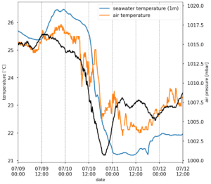
More from Atlantic Shores
Posted on July 13th, 2020 No commentsBelow is another plot of the Atlantic Shores buoy data. Cliff Watkins (a Rutgers grad student who hopes to soon be working on hurricanes and typhoons for the Navy) took the 3 weekend plots of air pressure (black), air temperature (orange), and water temperature (blue) and combined them into one plot below. The air pressure drops to a minimum about 18-20 GMT on July 10. Remember how warm the Mid Atlantic’s coastal ocean was before Fay? How Matt Oliver’s (a past Rutgers grad student, now a professor at U.Delaware) Sea Surface Temperature Anomaly product had it warmer than usual by about 2C or more.
In the plot below, on July 9, at the Atlantic Shores buoy off Atlantic City, the ocean (blue line) was warmer than the air above it (orange line). As the storm approaches and the air pressure drops ahead of eye, so does the ocean temperature. Just after mid-day on July 10, the air-sea temperature difference changes sign, and the ocean remains colder than the air for the next few days. The sign of the air-sea temperature difference also effects the sign of the air sea heat fluxes, so instead of a warm ocean acting to increase the storm’s intensity, we see a cold ocean acting to weaken the storm.
Once again we see rapid ahead of eye cooling in a storm tracking up the Mid Atlantic coast. The next step is to investigate why it it cooled. Thinking back to the 100 or so talks I have given on the ahead of eye cooling discovery process for Irene, I have that one slide I have used more than any other, the slide made by Josh Kohut (past Rutgers grad student, now a Rutgers professor) showing the importance of the ocean observatory to the discovery process. The slide shoes the 3 steps in the discovery process. (1) That we used the satellite imagery to tell us what happened – that the ocean cooled by 5-11C. (2) We then used the glider to tell us when the cooling happened – ahead of eye. (3) Lastly we used the HF radar network and its maps of the ocean currents to explain why.
Tomorrow we look more at the Acoustic Doppler Current Profiler on the Atlantic Shores buoy, and see if we can figure out why the ocean cooled so rapidly by looking at the currents. I think Sage Lichtenwalner (a past Rutgers undergrad) has some NSF REU students following along. For those students, and any other students who may be checking in, this is the discovery process. It never gets old. Just ask Josh or Matt or Cliff or Sage.
