-
Barrier Layers south of Puerto Rico
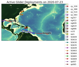
Posted on July 24th, 2020 No commentsThe map below shows where we have the gliders deployed, and where the hurricanes are going. This entry is going to look at the gliders north of Gonzalo’s track. This is where we noted the biggest difference in the sea surface salinity between the Navy GOFS model and the European Copernicus model. We are going to look at 3 gliders south of Puerto Rico, and compare it to the features we see in the GOFS and European models. We’ll look at SeaGlider SG663 (orange triangle on the far west), SG664 (red diamond in the middle), and SG669 (red circle in the middle).
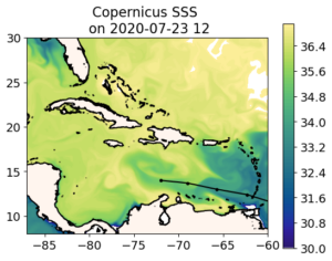
Remember the European model from the last blog. South of Hispaniola, the water is very salty. South of Puerto Rico, the water is very fresh. Over by St. Croix we have salt water entering through the Anegoda passage.
As noted in the previous blog, when we compare the GOFS (and its descendants) to Copernicus, we are looking at two already very good representations of the global ocean, and we are debating the relative merits of different approaches, often in the area of data assimilation. So fo easy reference I am adding below the Navy GOFS surface salinity as the start of the hurricane ocean forecast value chain. As the Naval Oceanographic Command likes to say, “It starts with us”.
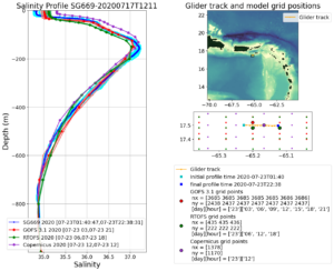
Now we will look at the three most southern gliders in the Hurricane Glider Picket Line.
We start with the eastern most glider over by St Croix, where the European model has the transport of salty water in through the Anegoda Passage. Getting the transport through the Anegoda passage in the global models is not easy, as we saw in 2018, when the global model transport through the passage was opposite of the transport observed by an array of 3 Navy gliders (thanks to the Naval Oceanographic Command for supporting their scientists) .
Here is the salinity profile for glider SG669. Blue is the salinity profile from the glider. Red is the data assimilative GOFS. Green is its descendent RTOFS. Purple is the European Copernicus. My first impression is wow, we have some pretty awesome data assimilative global models out there. The overall structure of the water column for salinity is right, enabling us to move onto the more important discussions on the details of the ocean features and their evolution. Our feature of interest is the surface freshwater barrier layers, since the barrier layers inhibit mixing and that has the potential to increase hurricane intensity. At the surface we are seeing an observed ocean that is fresher than all the models. This prompts the question, what is causing the difference, should our our models be transporting the salty water in through the Anegoda, or the freshwater out through the Anegoda, or do we just have salinity randomly wrong? The quality of the model-data fit below leads me to believe it is a good time to look at transports through the passages, one of our hurricane Essential Ocean Features. This is why we placed the triangular array of three Navy gliders in the Anegoda passage in 2018, to diagnose what was going on, and how we were doing. And this is why RU29 will be heading back to the Anegoda later this summer equipped with an current profiler so that it can get simultaneous temperature, salinity and current profiles, enabling us to look at the transports of mass, heat, and fresh water in the various layers to see specifically what we can fix in these models to improve the transports. Some of that improvement may be achieved when we go to the regional scale models with the better resolution. Some may be through improved data assimilation.
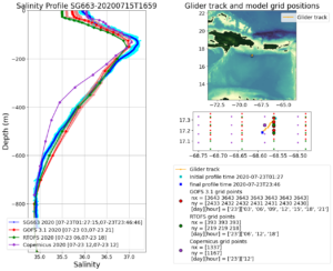
Now we move to SG663, south of Hispaniola, in what Copernicus thinks is the very salty water surface water compared to GOFS. Here the European model gets the salty surface water very well. By the time it makes it down to the RTOFS model the surface salinity is about 0.5 units too fresh. But what is going on with the European model at a depth between 200 m and 600 m. The salinity profile in this region is too low. If this was a temperature profile, the first place I would look is in how the satellite altimetry is assimilated. For temperature, the surface is usually kept on track by the satellite SST, the very deep water is kept on track by the global Argo program, and this middle depth between the two can often be traced to the mesoscale variability that is dominated by the assimilation of satellite altimetry. Unlike the surface barrier layers were T-S relationships lose their value, the T-S relationships in this middle depth work very well. This one reason why the Navy’s method of satellite altimetry data assimilation through the Improved Synthetic Ocean Profile (ISOP) method looks so good in this middle region. And this is why we are prioritizing the model-glider data comparisons in this middle region for the new RTOFS-DA system as it comes on line this summer. One of the differences between the data assimilation in GOFS and ROTFS-DA is how the altimetry is assimilated. This is part of the water column is where we will see those differences play out.
Now lets look south of Puerto Rico in the fresh water. South of Puerto Rico, the NOAA RTOFS model gets the surface salinity right on. We are in the middle of the AOML glider array, so we are seeing the value. The gliders do two things really, really well – sharpen the mesoscale – that mid-depth range we just talked about, and resolve both temperature and salinity in the surface waters where T-S relationships are not going to help. Altimetry data is global, but is relatively sparse in time and space. A well designed Glider array is regional, not global, but is relatively intense in time and space. The two are complimentary.

-
Gonzalo over the Amazon-Orinoco Plume
Posted on July 24th, 2020 No commentsBelow we have the forecast track of Gonzalo across the Windward Islands and along the strong southern edge of the Amazon and Orinoco River plume. We look at how the fresh water from these river plumes is distributed in 3 operational global ocean models (GOFS, ROTFS and Copernicus) and the 2 operational hurricane models (HMON and HWRF).
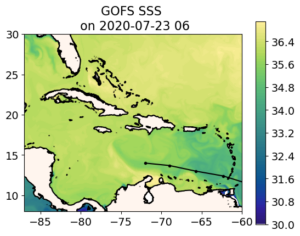
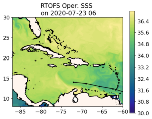
First model is Navy Global Ocean Forecast System (GOFS 3.1). The forecast track of Gonzalo is black line with the dots at the forecast locations. A rare southern track along the Caribbean Corridor. The map is of the surface salinity. The plume meanders along the north coast of South American and then is wrapped around an anticyclonic (clockwise rotating) eddy just south of Hispaniola. The eddy covers the entire width of the Caribbean, so it is hard for a hurricane to miss it, and the anticyclonic motion means it has deep warm pool. Fresh water from the river plumes in the surface barrier layers further inhibit mixing by the hurricane as it passes over, reducing the amount of ocean cooling, which can effect intensity. Also not that the fresh water plume signal disappears about the location of the Nicaraguan Bank that runs from Nicaragua to Jamaica and on to Hispaniola. This structure for the freshwater is very similar to what Doug Wilson found in the climatology.
Now on to the NOAA Real Time Ocean Forecast System (RTOFS). Not much difference. RTOFS is derived from GOFS 3.1. The process was described in an earlier blog. Navy GOFS assimilates all the ocean data up to today, then RTOFS looks back 2 days in the GOFS model, pulls the 3-D GOFS fields as an initial condition, and the moves back up to the present and into the future with NOAA winds replacing the Navy winds. The trade off between 2 days of winds versus 2 days of assimilation looks less significant at this scale. RTOFS and GOFS SSS look about the same in terms of the features of interest, in this case, the location of the plumes.
Now for the 3rd ocean model, the global European model in the Copernicus System. Now we see a much bigger difference. In particular, a much fresher Amazon-Orinoco Plume. The fresh water under the track of Gonzalo if fresher in the European model, and resulting a a more pronounced signature for the anticyclonic eddy. Maybe even more significantly, looking just west of the Windward Islands, in the place where AOML has the many gliders deployed around Puerto Rico, the European model is much fresher. This is something we can check out with the gliders. Which global model is doing better with the salinity of the barrier layers south of Puerto Rico.
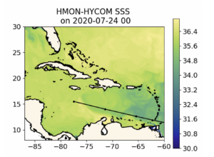
.Now we look at the regional ocean in the first operational hurricane model, HMON. This hurricane model is coupled to a regional version of HYCOM that gets its initial condition by pulling the 3-D fields from RTOFS. So it looks very much like RTOFS, which looks very much like the data assimilative Navy GOFS. All the same comments apply. Gonzalo is forecast to travel over the strong southern edge of the Amazon-Orinoco plume and eventually cross the warm eddy.
.
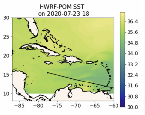
Lastly we look at HWRF. HWRF ins coupled to a regional version of the MPIPOM model that gets its initial condition from climatology modified by feature models for the Loop Current, the Gulf Stream, and some of the eddies. It appears that there is no anticylconic eddy added to the ocean model south of Hispaniola, and the Amazon-Orinoco plume is represented by climatology. This is a very different ocean. When we look at the differences between Navy GOFS (and RTOFS and HYCOM under HMON) with European Copernicus, we are debating the relative strength of the Essential Ocean Features like eddies and river plumes, and how different data assimilation schemes result in changes to these features. When we compare to MPIPOM under HWRF, we are debating if the same Essential Ocean Features even exist in the eyes of the hurricane.