-
Hurricane Hanna
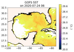
Posted on July 25th, 2020 No commentsHanna is forecast to become a hurricane today as it approaches landfall. Lets look at the ocean’s Sea Surface Temperature (SST) in the 3 global models beneath Hanna.
Keeping with the “It starts with us” tradition, here is the Navy Global Ocean Forecast System (GOFS 3.1). The track of Hanna is shown as the black line with the eye location dots approaching the Texas coast in the western Gulf. The SST is very warm, so warm it goes off of our standard scale and turns white for above 30C. In this region, forecasters often look to see if the surface temperature is above 26C for a quick assessment of how much the ocean supports intensification. Looks like it does. Hanna is currently over the warmest water, and that water cools down to the 28C range as it approaches shore. Note that the cooling down goes to 28C, which is still above the 26C diagnostic.
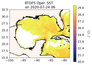
Now lets move to GOFS descendent RTOFS. Recall that RTOFS backs up two days into GOFS to get its initial conditions, giving up 2 days of data assimilation in favor of getting the NOAA global windfields over the ocean. The fields are nearly identical, with a slight shift of the over 30C water south along the Texas coast and east along the Yucatan coast. In this case, the warm water extending beyond our color bar turns into an unexpected benefit.
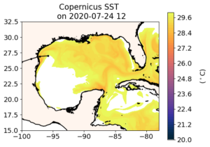
Now on to the European model. The western Gulf looks similar to GOFS – both are assimilating the same satellite SST data and SST dominates at the surface. Details differ, and offer room for investigation. But what really catches my eye is the western Caribbean where we see warming in the progression of models from GOFS to RTOFS to Copernicus. This area of the Caribbean between the Nicaraguan Bank and the Yucatan Strait between Mexico and Cuba is on the hurricane pathway into the Gulf of Mexico. The fresh water barrier layers we find so important east of the Nicaraguan Bank appear to be absent in this region.
At some point I hope to add similar snapshots of the ocean under the operational hurricane models, the regional HMON and HWRF. HMON uses the regional HYCOM derived from RTOFS. It is the endpoint in the GOFS to ROTFS to HYCOM value chain. We can already imagine what the regional HYCOM will look like, similar to the models from which it is derived. But operational HWRF is coupled to MPIPOM which uses a different value chain to get its initial condition. So the critical step here is getting MPIPOM, but this still requires human intervention. Access to the global models is public, and is easily automated so our model/data comparisons run in the middle of the night while we sleep. The operational models are where they should be, protected behind the firewall. This is one reason why the ocean community is looking forward to the new, more open, Hurricane Analysis and Forecast System (HAFS). The first model scheduled to move into the HAFS environment is HWRF. Which ocean is coupled to the version of HWRF that will someday be in HAFS is of high interest.
-
Barrier Layers south of Puerto Rico
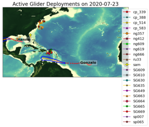
Posted on July 24th, 2020 No commentsThe map below shows where we have the gliders deployed, and where the hurricanes are going. This entry is going to look at the gliders north of Gonzalo’s track. This is where we noted the biggest difference in the sea surface salinity between the Navy GOFS model and the European Copernicus model. We are going to look at 3 gliders south of Puerto Rico, and compare it to the features we see in the GOFS and European models. We’ll look at SeaGlider SG663 (orange triangle on the far west), SG664 (red diamond in the middle), and SG669 (red circle in the middle).
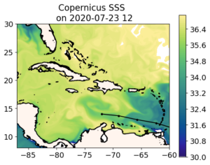
Remember the European model from the last blog. South of Hispaniola, the water is very salty. South of Puerto Rico, the water is very fresh. Over by St. Croix we have salt water entering through the Anegoda passage.
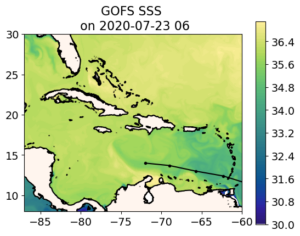
As noted in the previous blog, when we compare the GOFS (and its descendants) to Copernicus, we are looking at two already very good representations of the global ocean, and we are debating the relative merits of different approaches, often in the area of data assimilation. So fo easy reference I am adding below the Navy GOFS surface salinity as the start of the hurricane ocean forecast value chain. As the Naval Oceanographic Command likes to say, “It starts with us”.
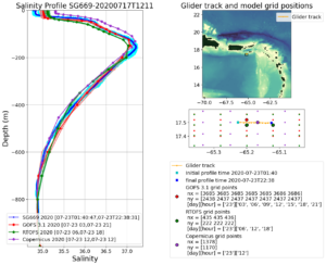
Now we will look at the three most southern gliders in the Hurricane Glider Picket Line.
We start with the eastern most glider over by St Croix, where the European model has the transport of salty water in through the Anegoda Passage. Getting the transport through the Anegoda passage in the global models is not easy, as we saw in 2018, when the global model transport through the passage was opposite of the transport observed by an array of 3 Navy gliders (thanks to the Naval Oceanographic Command for supporting their scientists) .
Here is the salinity profile for glider SG669. Blue is the salinity profile from the glider. Red is the data assimilative GOFS. Green is its descendent RTOFS. Purple is the European Copernicus. My first impression is wow, we have some pretty awesome data assimilative global models out there. The overall structure of the water column for salinity is right, enabling us to move onto the more important discussions on the details of the ocean features and their evolution. Our feature of interest is the surface freshwater barrier layers, since the barrier layers inhibit mixing and that has the potential to increase hurricane intensity. At the surface we are seeing an observed ocean that is fresher than all the models. This prompts the question, what is causing the difference, should our our models be transporting the salty water in through the Anegoda, or the freshwater out through the Anegoda, or do we just have salinity randomly wrong? The quality of the model-data fit below leads me to believe it is a good time to look at transports through the passages, one of our hurricane Essential Ocean Features. This is why we placed the triangular array of three Navy gliders in the Anegoda passage in 2018, to diagnose what was going on, and how we were doing. And this is why RU29 will be heading back to the Anegoda later this summer equipped with an current profiler so that it can get simultaneous temperature, salinity and current profiles, enabling us to look at the transports of mass, heat, and fresh water in the various layers to see specifically what we can fix in these models to improve the transports. Some of that improvement may be achieved when we go to the regional scale models with the better resolution. Some may be through improved data assimilation.
Now we move to SG663, south of Hispaniola, in what Copernicus thinks is the very salty water surface water compared to GOFS. Here the European model gets the salty surface water very well. By the time it makes it down to the RTOFS model the surface salinity is about 0.5 units too fresh. But what is going on with the European model at a depth between 200 m and 600 m. The salinity profile in this region is too low. If this was a temperature profile, the first place I would look is in how the satellite altimetry is assimilated. For temperature, the surface is usually kept on track by the satellite SST, the very deep water is kept on track by the global Argo program, and this middle depth between the two can often be traced to the mesoscale variability that is dominated by the assimilation of satellite altimetry. Unlike the surface barrier layers were T-S relationships lose their value, the T-S relationships in this middle depth work very well. This one reason why the Navy’s method of satellite altimetry data assimilation through the Improved Synthetic Ocean Profile (ISOP) method looks so good in this middle region. And this is why we are prioritizing the model-glider data comparisons in this middle region for the new RTOFS-DA system as it comes on line this summer. One of the differences between the data assimilation in GOFS and ROTFS-DA is how the altimetry is assimilated. This is part of the water column is where we will see those differences play out.
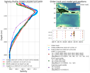
Now lets look south of Puerto Rico in the fresh water. South of Puerto Rico, the NOAA RTOFS model gets the surface salinity right on. We are in the middle of the AOML glider array, so we are seeing the value. The gliders do two things really, really well – sharpen the mesoscale – that mid-depth range we just talked about, and resolve both temperature and salinity in the surface waters where T-S relationships are not going to help. Altimetry data is global, but is relatively sparse in time and space. A well designed Glider array is regional, not global, but is relatively intense in time and space. The two are complimentary.

-
Gonzalo over the Amazon-Orinoco Plume
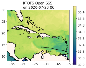
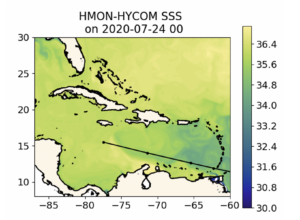
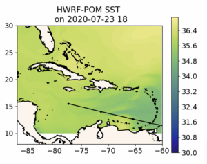
Posted on July 24th, 2020 No commentsBelow we have the forecast track of Gonzalo across the Windward Islands and along the strong southern edge of the Amazon and Orinoco River plume. We look at how the fresh water from these river plumes is distributed in 3 operational global ocean models (GOFS, ROTFS and Copernicus) and the 2 operational hurricane models (HMON and HWRF).
First model is Navy Global Ocean Forecast System (GOFS 3.1). The forecast track of Gonzalo is black line with the dots at the forecast locations. A rare southern track along the Caribbean Corridor. The map is of the surface salinity. The plume meanders along the north coast of South American and then is wrapped around an anticyclonic (clockwise rotating) eddy just south of Hispaniola. The eddy covers the entire width of the Caribbean, so it is hard for a hurricane to miss it, and the anticyclonic motion means it has deep warm pool. Fresh water from the river plumes in the surface barrier layers further inhibit mixing by the hurricane as it passes over, reducing the amount of ocean cooling, which can effect intensity. Also not that the fresh water plume signal disappears about the location of the Nicaraguan Bank that runs from Nicaragua to Jamaica and on to Hispaniola. This structure for the freshwater is very similar to what Doug Wilson found in the climatology.
Now on to the NOAA Real Time Ocean Forecast System (RTOFS). Not much difference. RTOFS is derived from GOFS 3.1. The process was described in an earlier blog. Navy GOFS assimilates all the ocean data up to today, then RTOFS looks back 2 days in the GOFS model, pulls the 3-D GOFS fields as an initial condition, and the moves back up to the present and into the future with NOAA winds replacing the Navy winds. The trade off between 2 days of winds versus 2 days of assimilation looks less significant at this scale. RTOFS and GOFS SSS look about the same in terms of the features of interest, in this case, the location of the plumes.
Now for the 3rd ocean model, the global European model in the Copernicus System. Now we see a much bigger difference. In particular, a much fresher Amazon-Orinoco Plume. The fresh water under the track of Gonzalo if fresher in the European model, and resulting a a more pronounced signature for the anticyclonic eddy. Maybe even more significantly, looking just west of the Windward Islands, in the place where AOML has the many gliders deployed around Puerto Rico, the European model is much fresher. This is something we can check out with the gliders. Which global model is doing better with the salinity of the barrier layers south of Puerto Rico.
.Now we look at the regional ocean in the first operational hurricane model, HMON. This hurricane model is coupled to a regional version of HYCOM that gets its initial condition by pulling the 3-D fields from RTOFS. So it looks very much like RTOFS, which looks very much like the data assimilative Navy GOFS. All the same comments apply. Gonzalo is forecast to travel over the strong southern edge of the Amazon-Orinoco plume and eventually cross the warm eddy.
.
Lastly we look at HWRF. HWRF ins coupled to a regional version of the MPIPOM model that gets its initial condition from climatology modified by feature models for the Loop Current, the Gulf Stream, and some of the eddies. It appears that there is no anticylconic eddy added to the ocean model south of Hispaniola, and the Amazon-Orinoco plume is represented by climatology. This is a very different ocean. When we look at the differences between Navy GOFS (and RTOFS and HYCOM under HMON) with European Copernicus, we are debating the relative strength of the Essential Ocean Features like eddies and river plumes, and how different data assimilation schemes result in changes to these features. When we compare to MPIPOM under HWRF, we are debating if the same Essential Ocean Features even exist in the eyes of the hurricane.
-
Currents from Atlantic Shores
Posted on July 14th, 2020 No commentsNow we look more into the why question. We know the surface water cooled significantly during Fay (5-6C), and we know that 70-90% of the cooling was ahead of eye, and that the ahead of eye ocean cooling changed the sign of the air-sea heat flux. But why?
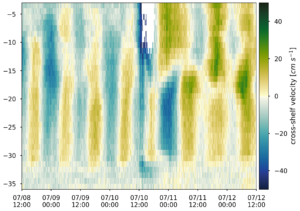
Here Cliff looked more deeply at the currents measured by an Acoustic Doppler Current Profiler (ADCP) on the Atlantic Shores buoy. In the plot below, we rotate the currents into the cross-shore and along-shore framework, and here plot the cross-shore component. Blue represents strong currents towards the coast, green represents strong currents towards the offshore. The y-axis is the water depth of each ADCP data bin in meters.
You can see the storm take over on July 10 after about 12 GMT. There is a very strong jet towards the coast. So strong it maxed out the 50 cm/sec range on the current measurements. Before and after, especially in the bottom layer, you see the 12 hour 25 minute tidal signals.
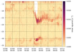
Next we look at the shear squared also plotted as a function of depth. During the storm, the surface mixed layer is expected to have very little shear, being well mixed, and most of the shear will be concentrated across the thermocline. What lights up the image below is the very strong shear layer deepening from 10 m to 17 m ahead of eye. Strong shear across the thermocline causes the familiar Kelvin Helmholtz rolls that act to broaden the thermocline. Large Eddy Simulation (LES) modeling (thank you Cliff and Dan, paper submitted) indicates that the tops of the Kelvin Helmholtz rolls are harvested by the intense mixing in the upper layer, cooling the upper mixed layer and deepening the upper mixed layer. Looks like we are again seeing shear induced mixing across the thermocline resulting in a deeper and cooler mixed layer.
Thanks Atlantic Shores, for deploying this buoy and for sharing the data through MARACOOS. We already see two papers coming from this one event, this one on the shear induced mixing and cooling, and the other on the coupled co-evolution of the ocean and atmosphere we are seeing in the coupled research models.
-
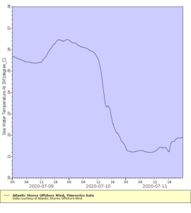
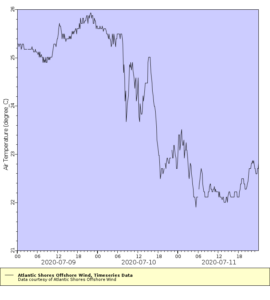
More from Atlantic Shores
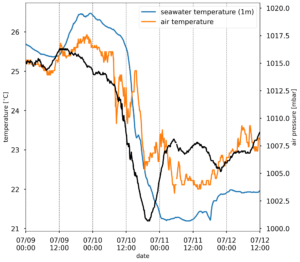
Posted on July 13th, 2020 No commentsBelow is another plot of the Atlantic Shores buoy data. Cliff Watkins (a Rutgers grad student who hopes to soon be working on hurricanes and typhoons for the Navy) took the 3 weekend plots of air pressure (black), air temperature (orange), and water temperature (blue) and combined them into one plot below. The air pressure drops to a minimum about 18-20 GMT on July 10. Remember how warm the Mid Atlantic’s coastal ocean was before Fay? How Matt Oliver’s (a past Rutgers grad student, now a professor at U.Delaware) Sea Surface Temperature Anomaly product had it warmer than usual by about 2C or more.
In the plot below, on July 9, at the Atlantic Shores buoy off Atlantic City, the ocean (blue line) was warmer than the air above it (orange line). As the storm approaches and the air pressure drops ahead of eye, so does the ocean temperature. Just after mid-day on July 10, the air-sea temperature difference changes sign, and the ocean remains colder than the air for the next few days. The sign of the air-sea temperature difference also effects the sign of the air sea heat fluxes, so instead of a warm ocean acting to increase the storm’s intensity, we see a cold ocean acting to weaken the storm.
Once again we see rapid ahead of eye cooling in a storm tracking up the Mid Atlantic coast. The next step is to investigate why it it cooled. Thinking back to the 100 or so talks I have given on the ahead of eye cooling discovery process for Irene, I have that one slide I have used more than any other, the slide made by Josh Kohut (past Rutgers grad student, now a Rutgers professor) showing the importance of the ocean observatory to the discovery process. The slide shoes the 3 steps in the discovery process. (1) That we used the satellite imagery to tell us what happened – that the ocean cooled by 5-11C. (2) We then used the glider to tell us when the cooling happened – ahead of eye. (3) Lastly we used the HF radar network and its maps of the ocean currents to explain why.
Tomorrow we look more at the Acoustic Doppler Current Profiler on the Atlantic Shores buoy, and see if we can figure out why the ocean cooled so rapidly by looking at the currents. I think Sage Lichtenwalner (a past Rutgers undergrad) has some NSF REU students following along. For those students, and any other students who may be checking in, this is the discovery process. It never gets old. Just ask Josh or Matt or Cliff or Sage.
-
Atlantic Shores Buoy off Atlantic City – 90% ahead of eye cooling
Posted on July 12th, 2020 No commentsFay continues to capture our attention with its ahead of eye cooling. Travis and I are now look at Fay using the Atlantic Shores buoy deployed in the Wind Energy Area off Atlantic City, NJ. This buoy is closer to landfall and south of the NDBC buoy in last night’s post. Atlantic Shores makes its buoy data available through the MARACOOS OceansMap, and you can download it as ERDDAP files. Here we look at it through the ERDDAP interface.
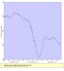
First plot is the air pressure. The minimum occurs at about 20 GMT on July 10. We will use this as the time of eye passage.
We now look at the ocean temperature from the sensor at 1 m depth below the surface. The water temperature cools from 26.5C before the storm to about 22C at eye passage at 20 GMT on July 10. Total of 4.5C cooling ahead of eye. The minimum temperature looks to be about 21.5C, so an additional 0.5C of cooling after eye passage. So for the total of 5C cooling caused by the passage of the storm, 90% occurs ahed of eye, and 10% after eye passage. Another good case for ahead of eye cooling and rapid co-evolution of the ocean and atmosphere.
So how does this feedback on the atmosphere? Lets look at the air temperature from the Atlantic Shores buoy. Because of the rapid ocean cooling, the ocean is colder than air temperatures. The heat flux is from the hurricane into the ocean, which acts to weaken the storm. If our forecast had kept the ocean temperatures warm – a static ocean rather than a co-evolving ocean – the ocean would be warmer than the air temperatures, changing the sign of the heat flux and strengthening the storm.
This clearly demonstrates the value of IOOS collaborations between the Regional Associations, industry, and academic partners.
-
Fay from a NDBC buoy – 2/3 ahead of eye cooling
Posted on July 11th, 2020 No commentsTropical Cyclone Fay shot up the Mid Atlantic Bight yesterday, making landfall around Atlantic City. Like an early season Irene (2011).
Irene is the famous storm where the MARACOOS ocean observatory, and its associated regional ocean and atmospheric forecast models, was used to identify the Essential Ocean Processes responsible for rapid ahead-of-eye cooling of the ocean, and the subsequent Rapid Weakening (RW) of the storm (see the paper linked in yesterday’s blog). The paper looked at over 130 atmospheric forecast sensitivity runs to discover that hurricane-forced ahead-of-eye ocean cooling was the critical missing physical process required to properly match the observed Rapid Weakening (RW) of Irene as it tracked through the Mid Atlantic. It’s a process we call rapid co-evolution of the atmosphere and ocean during the intense forced phased of a hurricane.
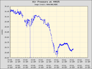
Looks like the best NDBC buoy to check for ahead of eye cooling is 44025, up in the Bight Apex.
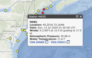
First we look at the atmospheric pressure. The minimum pressure is July 11, about 01 GMT.
Now we look at the ocean temperature. Starts about 78F before the storm. At 01 GMT on July 11, the water temperature has cooled to about 72F, so 6 degrees F ahead of eye center cooling. The minimum temperature on 7/11 is about 69F, so 3F cooling after eye passage.
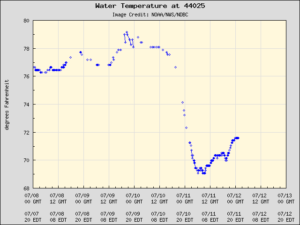
Result is 2/3 of the cooling ahead of eye, 1/3 of the cooling after eye passage. And this is for a buoy north of the landfall location. I would expect more cooling opportunity south of landfall. We’ll need to check the models for that.
How does this compare to the other Irene-class hurricanes that track across the Mid Atlantic? That same Nature Comms paper quoted yesterday has the table of all 11 Irene-class hurricane occurring between Charlie (1986) and Arthur (2014). The average percentage of ahead of eye cooling for these 11 hurricanes, based on the truly awesome 40 year NDBC buoy record, is 73%. And Fay is already at 66% ahead of eye cooling on our first look.
Physics is awesome. Thank you Adm. Lautenbacher.
-
The Operational System – Thank you Fay
Posted on July 10th, 2020 No commentsHWRF is one of the world’s best hurricane forecast models. Our job is to improve the ocean model component of HWRF to make it even better.
Now we just can’t look at the operational HWRF whenever and wherever we like. The operational HWRF is kicked-off by the presence of a hurricane and it follows the hurricane. So we need a hurricane, or at least a tropical storm, to track through the Mid Atlantic to get a look at the ocean that the operational HWRF is using in this region.
Thank you Fay.
Below is temperature transect across the Mid Atlantic shelf along the Tuckerton Endurance Line. It is along the same cross-shelf transect as the previous blog post from yesterday (below), but it uses a different color scale since it had to be generated on one of the operational computers. We’ll download the data and fix that next week. But here is a quick look just as Fay was beginning its northward track up the Mid Atlantic coast. Right away you can see some differences between this ocean model and the Navy, NOAA and European global models, plus the MARACOOS regional model, posted in the previous blog.
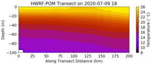
First issue is the water depth. Moving offshore from 0 on the X-axis, the actual bottom should start at about 20 m depth, and run to about 100 m depth about 125 km offshore. Here the water depth is deeper than 100 m almost along the entire transect.
Second issue is the temperature structure. We are missing the Essential Ocean Features of the Mid Atlantic shelf – the thin warm surface layer, the intense thermocline between 10 m and 15 m, and the widespread Cold Pool beneath. Our NOAA-sponsored science has proven that these Essential Ocean Features are critical for better intensity forecasts in our Mid Atlantic research models (https://www.nature.com/articles/ncomms10887). And if this ocean does give us a better intensity forecast in the operational model, it means something else is wrong and is compensating for the less accurate ocean. This is why we need intermediate metrics along the entire forecast value chain. Did we improve the ocean model? Did we improve the air-sea interactions? Did we improve the intensity forecast? The intermediate metrics help us identify where we are doing well, and where we need to focus more work.
There is an easy to read viewpoint article on this by Kerry Emanuel, MIT’s expert on hurricanes. https://agupubs.onlinelibrary.wiley.com/doi/full/10.1029/2019AV000129#.XvXR-OhrkjI.twitter
Six paragraphs from the end, the one that starts “Sometimes the quest for better simulations…”, is especially relevant.
Thank you Fay.
-
Tropical Storm Fay in the Mid Atlantic
Posted on July 9th, 2020 No commentsTropical Storm Fay is shown here leaving the Gulf Stream where it will rapidly be heading north across the Mid Atlantic shelf. NHC forecasters called for Fay to intensify over the Gulf Stream then weaken as it passed over the Mid Atlantic shelf. Surface waters on the shelf are anomalously warm this year, but they much cooler than the Gulf Stream as seen here. Still the biggest source of cold water in the region – the Mid Atlantic Cold Pool – is unseen from space. It spends much of its summer below a 10-20m thick layer of warm, fresh surface water. To see this Cold Pool, you have to go out and touch it with a CTD. Thats why we send out the shallow water gliders in the summer. Simultaneously WHOI is sending out the deep gliders to monitor the evolving Gulf Stream. This way there are gliders in the Gulf Stream making sure the models have the right characteristics where the hurricanes are expected to intensify, and gliders on the shelf where the storms have been shown to rapidly weaken due to ahead-of-eye mixing and cooling. These rapid intensity changes, both intensification and weakening, are one the the challenges of modern hurricane forecasting.
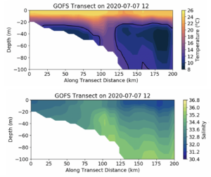
With Fay about to cross over the Mid Atlantic shelf, lets take look at the structure of the Cold Pool and the warm, fresh surface layer on a cross shelf line known as the Endurance Line, a glider line originating from Tuckerton, NJ and extending across the shelf, a line first occupied by gliders in 2003.
First model – the Navy Global Ocean Forecast System (GOFS). Top panel is temperature, bottom panel is salinity. In the temperature section Maria has drawn in the 12C isotherm as a black line. You can see the Cold Pool on the shelf between about 20 km to 100 km offshore. And it has a thin warm surface layer about 10m thick. A global model that has a Cold Pool on the continental shelf – pretty awesome how far we have come since hurricane Irene in 2011. Salinity will need to be watched. The surface fresh water barrier layers in the Mid Atlantic usually mimic the temperature field. If the temperature Mixed Layer Depth (MLD) is 10 m deep, the salinity MLD is often also about 10 m deep. Here there is no barrier layer, simply a cross-shelf gradient.
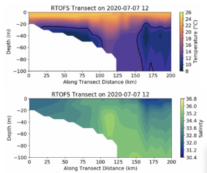
Global model #2 – NOAA Real Time Ocean Forecast System (RTOFS). This uses the data assimilative ocean produced by GOFS but forces it with NOAA winds. The shelf looks pretty similar for temperature, but offshore the shelf break, the cold water has moved farther offshore.
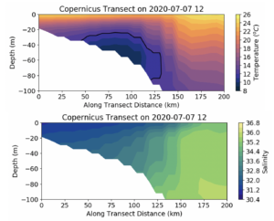
Global Model #3, the European Copernicus system. It has a Cold Pool, still an amazing accomplishment for a global model, but the structure on the shelf is very different. The Cold Pool is much farther offshore, and the thermocline is weaker and thicker. More downwelling pushing the cold bottom water offshore?
Fourth model – regional Doppio. This definitely looks like a downwelling example, where the core of the Cold Pool is moved offshore and the nearshore isotherms in the bottom layer bend downward. And the salinity also has the usual barrier layer structure, the there is a surface pool of low salinity water and the temperature and salinity MLDs are both about the same.
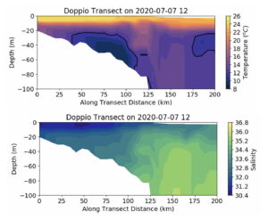
In the Caribbean, the low salinity surface layer is usually shallower than the temperature mixed layer depth, so any surface induced mixing has to break through both the halocline and the thermocline, so it is important to get both temperature and salinity upper ocean structures right. In the Mid Atlantic, the halocline and thermocline are often co-located, resulting in a stronger pycnocline, so it is important to get both the temperature and salinity upper ocean structure right.
-
Complimentary aspects of Argo and Gliders
Posted on July 1st, 2020 No commentsA question from the IOOS-OAR collaboration workshop yesterday concerned how Argo and Gliders are complimentary.
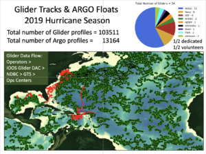
Below is a plot of the locations of the Argo profiles during the 2019 hurricane season compared to the tracks of the gliders during the same time period.
The Argo floats provide the broad spatial coverage over large areas of the ocean. The gliders are concentrated in regions that have less or no Argo coverage, like the Gulf Stream, the Caribbean, and definitely on the continental shelves. Each Argo float typically provides a profile once every 10 days. Gliders provide multiple profiles a day, and can be directed across strong currents. Over 100,000 glider profiles were provided by the community’s glider fleet during the 2019 hurricane season.