


-
Hurricane Delta in the Regional Forecast Models
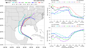
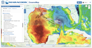
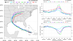
Posted on October 7th, 2020 No commentsRemarkable agreement this morning between the two operational hurricane forecast models HWRF and HMON. Both have similar tracks, something we see often, and this morning both are also agreeing on intensity plotted in the upper right in the figure below. Both HWRF and HMON (purple and green lines) have Hurricane Delta just below Category 4 as it crosses the warm waters of the Gulf. The 4 am CDT NHC Discussion notes that they are following the guidance from the stronger regional models, and we see that in the red line for the official forecast. The Discussion credits the high ocean heat content and the low upper level wind shear resulting in favorable conditions for an intense storm. Both models also rapidly drop in intensity after moving inland, but what happens just before landfall? The NHC Discussion highlights the importance of the competing ocean and upper level shear processes to decide if there will be any weakening just before landfall, noting there there is an increase in the upper level shear, and there is slightly less heat content in the ocean as the hurricane approaches the coast. The new experimental HAFS model, the light blue line below, has a more westward track and a significantly different intensity – lets mark that as a good discussion point for the winter reanalysis of this hurricane.
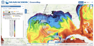
Below is the OceansMap view of that Sea Surface Temperature distribution. Delta if forecast to track right up through the center of the warmest surface temperatures in the western Gulf. It then crosses the slightly cooler waters approaching landfall, but even the blue shade below is above 27C. We do not see surface temperatures below 26C until right up by the coast. Also looks like we have 5 gliders nicely aligned cross track for the Hurricane Glider Picket Line, with 3 gliders spanning the track uncertainty cone, 2 gliders further off in the high wind areas to the left and right. The NHC Discussion notes that they expect Delta to grow in size as it approaches the northern Gulf.
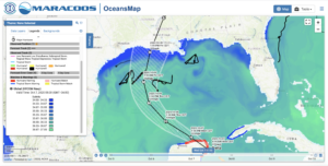
Next we look at the Sea Surface Salinity from the Navy GOFS Model. Look for any low salinity barrier layers that inhibit mixing and contribute to intensification. We see that the surface salinity is relative uniform across the Gulf with the low salinity barrier layers confined to the areas along the northern Gulf coast. So the band of slightly cooler surface waters that could promote weakening are also covered with a low salinity barrier layer that could promote intensification. Another test case for the winter reanalysis.
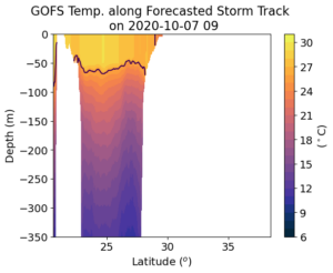
Now we look at the subsurface temperatures along track in the global ocean models where the ocean data assimilation takes place. The automated processing follows the hurricane track and plots the upper 350 m of the ocean temper field along the track. White areas are when the hurricane is over land. First is the Navy GOFS model that does the actual assimilation. The NOAA RTOFS model (second plot) looks back 2 days in the Navy model and then moves forward without assimilation but with the NOAA winds layered in. The global RTOFS then provides the initial condition for the coupled regional ocean model in HWRF and HMON. The first thing we note is that there is very little difference between the two models along the storm track – a good thing. The gliders and argo floats have all been deployed well in advance, and there has been plenty of time for the data to work its way into the assimilative model as well as the downstream NOAA forecast models. The two figures below also plot the location of the 26C isotherm as the black line. The depth of this isotherm used to calculate heat content is relatively constant across the Gulf, hovering around a depth of 50m-60m. Temperatures above the 26 C vary as you move north along the track but are relatively constant in the vertical in this upper layer down to this 26C isotherm. So SST is going to be a good proxy for the heat content variations pre-storm. We also see that only as the storm is crossing the shallow continental shelf waters nearshore does the temperature drop below 26C. Watching how this water reacts as the storm approaches is one thing we will be watching. As Delta approaches the coast from the south, these coastal waters will experience strong winds to the west. Alongshore winds to the west are downwelling favorable. Downwelling can move this cooler nearshore water off the shelf along the bottom, and replace it with warmer water transported in from offshore. Thus the hope that this band of cooler water may offer some protection assumes that the water is stationary, that it does not move. With strong nearly Cat 4 alongshore downwelling favorable winds from the leading edge of Delta, that water is going to move. Depending on the forward speed of Delta at the time, that water may have plenty of time to move well ahead of the eye passage. Just like we saw with the glider in Hurricane Sandy.

-
Sally tracks northwest, SG601 flies south
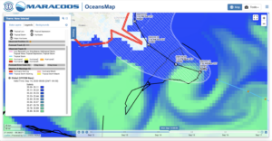
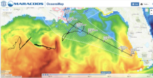
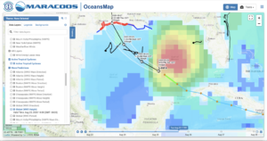
Posted on September 14th, 2020 No commentsThe image below is of the Navy GOFS sea surface salinity field. Enhancing this to focus the color bar on the salinities between 35 & 36 clearly shows the clockwise circulation of the warm eddy just southeast of the Mississippi delta. Sally is right over this warm eddy now, still as a tropical storm in this image. NHC forecast says it moving slowly and they say that it still has time to intensify. Glider SG601 is on the northern side of this ahead, just ahead of Sally. Kevin at USM is piloting it to the south to get into the eddy and even closer to the forecast track of Sally.
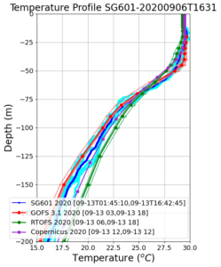
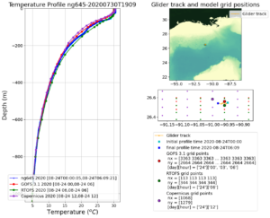
Lets take a look at the temperature profiles from SG601 and compare to the models moves more into the eddy and continues to experience the winds from Sally. Below the temperature profile is zoomed into the upper 200 m to get a look at the surface mixed layer in the upper 50 m where temperatures are in the 29C range. Below 50 m, we move into the thermocline, cross the 26C isotherm about 65 m depth. All models and data in good agreement down to about 75 m, then they diverge. GOFS (red) tends to stick with the Glider data (blue), while RTOFS (green) tends to be about 2C warmer between depths of 150 m to 200 m.
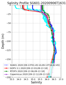
Salinity behavior is the opposite. Data and model are all in pretty good agreement below the mixed layer, but the salinity of the barrier layer varies widely. Note that the temperature mixed layer is 50 m deep, but the low salinity barrier layer is only 15 m deep. The salinity of the barrier layer is uncorrelated with temperature, so T-S relations don’t work, and you need to go out and measure the salinity. Light blue shows the spread in the salinity data from individual profiles. GOFS in red looks to be in with the mix of salinity profiles, which is expected, since only 1 salinity profile is chosen for assimilation each day. RTOFS has much less of a low salinity barrier layer.
-
“Rapid Intensification is a possibility…”
Posted on September 13th, 2020 No commentsHere is a screen shot of the 5 am National Hurricane Center discussion.
Last sentence in the screen shot tells us to watch the core of Sally on Monday. That rapid intensification is a possibility, ands stronger solutions like HWRF can’t be dismissed.
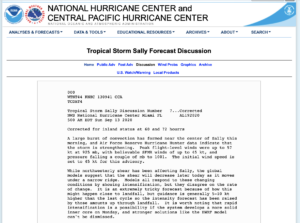
Lesson learned from Laura. Full text of the discussion here.
https://www.nhc.noaa.gov/text/refresh/MIATCDAT4+shtml/130941.shtml?
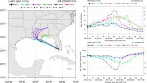
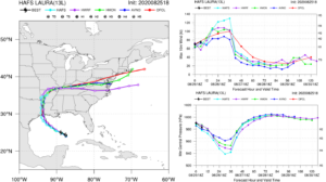
Latest forecasts are below. HMON rapidly intensifies nearly to Cat 4. HMON is in the middle, intensifying to nearly to Cat 2. Experimental HAFS stays a Tropical Storm. 50 knot spread in the intensity guidance. Plenty of room for new science.
-
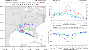
Hurricane Sally, a warm eddy, and glider SG601
Posted on September 12th, 2020 No commentsSally is leaving the wester coast of Florida, crossing the Gulf north of the Loop Current, and is forecast to intensify to a hurricane just before landfall in Louisiana. Looking at the regional hurricane models, seems we are repeating the Laura experience. On the left we see the tracks are pretty much straight to the northwest for all the models nearly until landfall. Operational HMON is the first pull away to the north while still over water, operational HWRF pulls away to the north after landfall, and experimental HAFS stays straight on the northwest course. Now look on the right at intensity. HWRF (purple) intensifies to the middle of Cat 3 just before landfall then quickly drops back to a tropical storm as it moves overland. HMON (green) intensifies to Cat 1 in about the same location, nearly touching the Cat 2 line, and stays in the Cat 1 region for quite some time as it lingers offshore. That lingering offshore always brings up questions of rainfall and freshwater flooding combined with salt water storm surge. HAFS (light blue) just continues straight through this HWRF/HMON decision point as a tropical storm the entire way, never reaching hurricane strength, and weakening to the lower limit of Tropical Storm as the two operational models are intensifying. The velocity spread between HWRF, HMON and HAFS is approaching 70 knots. The official NHC intensity forecast (red) favors HWRF up to 48 hours and HMON after 60 hours.
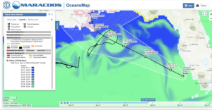
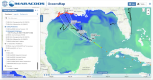
Lets see what the ocean is doing along this track. First a map of Sea Surface Temperature from the Navy GOFS model. Here the temperature image is enhanced to show the temperature above 26C, with darker blue being 26C and darker red being 32C. Sally leaves the warm West Florida Shelf, is forecast to track north of the Loop Current, staying over water in the 29.5C-30.0C range (green) until landfall. Looks like the NDBC Glider SG601 is on the right of the forecast track and the Navy Glider NG357 is on the left. Well positioned.
Now lets look subsurface in GOFS. Here is a vertical section of the upper 350 m of the water column along the forecast track from Maria’s daily collection. The x axis is latitude, and as the storm moves northwest, the latitude increases, so the West Florida Shelf is on the left hand side of this figure. The warmest water, warm top to bottom, above 30C. As the track moves north, it crosses an area where the 26C isotherm depth (black line) is relatively constant, near 40 m. Just north of 28N latitude, the 26C isotherm deepens to about 70 m. You see the warm core though the entire 350 m of the water column shown here. Sally then makes landfall in Louisiana.

So what is the warm core feature in the above section, and where is it located? As usual, it is hard to see the circulation patterns in the SST above, especially in the Gulf near summer. So lets try salinity, the freshwater from the Mississippi. Remember how in the Caribbean, we used salinity, specifically the freshwater from the Amazon and the Orinoco, as a tracer to highlight the mesoscale in the GOFS model. Below is the salinity map where we have enhanced the image to highlight the range of salinity from 35 or below (darkest blue) to 36 and above (brightest green). A perfectly circular anticyclonic warm eddy pops right out.
The track of Sally is forecast to go right over this warm eddy highlighted in the salinity field. The official forecast has Sally heading into the eddy as a Tropical Storm and heading out of the eddy as a hurricane. It looks like NDBC glider SG601 is heading south, towards the hurricane track and the center of the eddy.
-
Two figures from the recent past
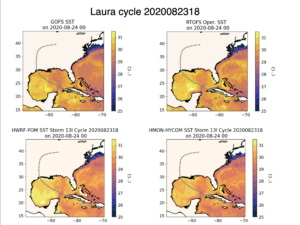
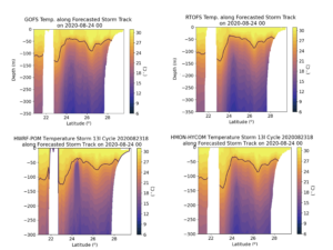
Posted on August 26th, 2020 No commentsNot everything happens in real time. Here we wanted to compare the the ocean under Laura for the entire forecast value chain that starts with the data assimilative GOFS, then ROTFS backs up 2 days, pulls the 3-D fields from GOFS and moves them forward in time with NOAA winds, then, for the operational forecasts, the initial condition for HMON’s coupled regional HYCOM model as well as the initial condition for HWRF’s coupled MPI-POM model are pulled from RTOFS. The plots from HWRF and HMON are constructed from the operational runs which are protected and still requires human-in-the-loop processing.
The first figure shows the SST map initialized at Aug 23 at 18Z for GOFS (upper left), RTOFS (upper right), HWRF-MPIPOM (lower left) and HMON-HYCOM (lower right). We are looking 6 hours ahead in the forecast to Aug 24 at 00Z. Variations between the models are generally in the 0.5C range, with the ocean in HWRF- MPIPOM the warmest. These variations are small compared to what we saw before the Aug 5 upgrade to the new version of HWRF.
The plots we really wanted to see were the vertical sections. Here we look at the upper 350 m of the water column along the track of Laura from the start of the forecast to landfall. The x-axis is latitude, starting with the south on the left. The white area near 22N is Cuba. The black line on the plot is the 26C isotherm. After leaving Cuba, Laura crosses the warm waters of the Loop Current, then the shallow warm water layer in the central Gulf. The main feature of interest here is the deeper layer of warm water near 26N. This layer is in the northwest corner of the Gulf, the area the hurricane is expected to intensify before landfall. Looking at the surface layer structure, we have long known that GOFS, ROTFS and HMON’s HYCOM will look similar. It is good to see how similar the ocean in HWRF’s MPIPOM is along this track. This is a big step forward with the new HWRF. It moves us to a new level of validation. Our communications used to concentrate on whether the Essential Ocean Features impacting hurricane intensity even existed in the models. Now we are talking about the detailed structure and evolution of the Essential Ocean Features. A big step change.
-
The morning of …
Posted on August 26th, 2020 No commentsSome comments from the National Hurricane Center’s 4 am Discussion:
Satellite images indicate that Laura has become a formidable
hurricane since yesterday evening.

The hurricane has intensified a remarkable 40 kt during the past 24
hours, and there are no signs it will stop soon, with shear
remaining low-to-moderate over the deep warm waters of the central
Gulf of Mexico.
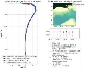
From the forecast guidance models below, we see good agreement on track on the left, and on the right, operational HWRF and HMON are in good agreement with the intensity increasing to Cat 3. HAFS increases intensity to Cat 4.
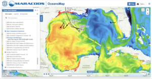
OceansMap has been updated with the 4 am track uncertainty cone. Laura is forecast to track over the relatively warm and fresh surface waters of the northwestern Gulf. Two Navy Gliders are within the track uncertainty cone, ng645 on the right, and ng314 on the left. TAMU glider Stommel is just off to the west in a small warm eddy. The automated morning glider/model comparisons should complete their run soon and we’ll get a look at the profiles from these gliders.
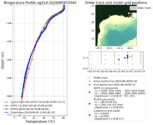
Navy Glider ng314 (left of track) is the first of the three comparison to process. We seem to be getting used to the global models doing well with assimilating the temperature data from gliders that have been deployed in advance of the storm.
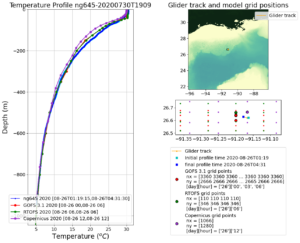
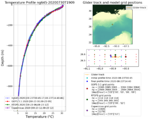
Navy Glider ng645 (right of track) is out. Same image we are getting used to. GOFS is assimilating the glider data nicely, and ROTFS is keeping in step with the NOAA winds. Both US models are doing slightly better than Copernicus in the critical upper 200 m.
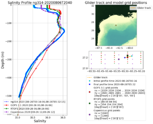
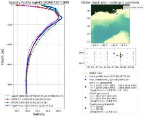
Now the look at salinity. First Glider ng314 on the left. We know salinity is harder – we have no satellite to help us with the smaller scale surface variations. So I expect variability near the surface, and we see it. Still the global models are resolving the Essential Ocean Feature in this region – the all have a surface barrier layer. GOFS and RTOFS even have the barrier layer at the right depth – thats good. Why is the observed surface salinity a bit less, something to come back to and figure out. Horizontal variability – we see a lot of this in the higher resolution oceans under HWRF and HMON. Also, we should track down what caused the deviation of GOFS in the 200 m to 600 m range. It has moved GOFS to slightly saltier values, but ROTFS remains aligned. That means it is likely to do with data assimilated by GOFS in the last 2 days, since RTOFS is always 2 days behind in the assimilation. This is the region of the profiles that we also see impacted by the altimetry. So what combination of altimetry and gliders, and what glider profiles are chosen for the assimilation if important to check. All these decisions have to be made in the implementation of RTOFS-DA that is being tested this summer. We can add another test case to the list.
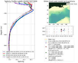
Lets finish with the salinity profile on the right of the track from ng645. Here GOFS is doing fine in the 200 m – 600 m range. This really does narrow the search for improvements we can implement in ROTFS-DA with two gliders in the same storm with different behaviors. But now the upper ocean. The barrier layers are there in all three global models, but how did the Europeans do so well on the salinity in that layer. The US models saw the impact of Marco, a mixing and increase in the surface layer salinity. Maybe the European’s had less change in the salinity during Marco, and now the real ocean is just coming back into agreement with a relatively steady Copernicus forecast? All good questions to check into as we refine the experimental RTOFS-DA, and eventually build the data assimilation procedures for the future ocean model MOM6.
-
The night before …
Posted on August 25th, 2020 No commentsOur friends on the Texas-Louisiana coast are tonight preparing for a significant storm that will hit late tomorrow. Our job is to not to waste this event. Learn as much as we can when these terrible storms do happen so we can help provide more accurate guidance with longer lead time in the future.
Lets look at the ocean conditions the night before. Here we look at the GOFS Sea Surface Temperature (satellite SSTs are obscured by the hurricanes clouds, so we need to look at the models). The most striking feature is the asymmetrical response of the Gulf to this storm that is not even half way across. Here the color bar ranges from 26C to 32C. The entire eastern Gulf has cooled to near 26C. The western Gulf is above average hot, closer to 31-32C. Laura is heading towards the warmer waters of the western Gulf. Also note that the intensification to Major Hurricane occurs just as the storm is making its way across the warm water on the LaTex shelf. Why is this storm forecast to intensify most over this piece of warm ocean? Is it so warm that the shallowness does not matter? Very happy to see what now have 3 gliders in play, two Navy Gliders, ng314 and ng645 in the direct forecast path, and TAMU glider Stommel just to the left.

Lets next look at why the eastern Gulf is so much cooler. First we overlay the 5 km NAM winds over the SST, and we see the strongest winds on the right hand side of the Laura as it moves north.
Next pop up the global Wave Watch III waves and we see the largest waves 7 m high or higher are on same right hand side of the Laura as the strong winds. Lots of wind and large waves mean lots of mixing , and a cooler SST.
Laura has itself set up this east-west SST difference across the Gulf. But want about salinity, and the impact of Marco? Below is todays GOFS model Sea Surface Salinity (SSS), enhanced to highlight salinities between 34 and 37. Here fresh-salty water distinction is between the northern and the southern Gulf, with the northern coastal Gulf fresher than the regions around it. So the area we are forecasting for the largest intensification is the north west region of the Gulf where we have both the warm western waters and the fresher northern waters.
-
Data assimilation vs rapid process evolution
Posted on August 24th, 2020 No commentsAdding this post so that we do not loose track of this event revealed by NG645 as it is passed by Marco.
First plot below is the temperature profile comparisons from this morning. The data assimilative GOFS is closest to the glider temperature profile. There is some cooling in the upper ocean in RTOFS. Recall that RTOFS backs up 2 days in GOFS, pulls the initial condition, and moves forward without data assimilation with the NOAA winds. GOFS is doing data assimilation up to the present. RTOFS relies on model processes to carry the evolution forward for the final 2 days. Hard to say which approach is better based on temperature.
But now lets check the salinity profiles, and the evolution of the barrier layer. Here GOFS (red) kept the barrier layer salinity low consistent with the pre-storm conditions. RTOFS (green) mixed the barrier layer fully consistent with the Navy glider profile (blue) based on physical processes over the last 2 days.
We saw similar behaviors in the data assimilation during Hurricane Michael in the Gulf a couple years ago. Perhaps this is another case where the choice of which CTD profile is assimilated during a period of rapid evolution makes a difference. Its an important time to investigate what we have noticed here, since RTOFS-DA is currently being run in experimental mode.
-
Leaning towards the regional models
Posted on August 24th, 2020 No commentsThe following is cut and pasted from the National Hurricane Center (NHC) Forecast Discussion at 5 am this morning:
We also started a similar discussion in yesterday’s Hurricane Blog. The two operational regional models are continuing to agree this morning, and NHC may be leaning towards this consensus. Below is what this looks like from the NWS HAFS website. On the left, all the models are in tight agreement on the forecast track of Laura over Cuba, and across the Gulf up until landfall. On the upper right, the differences in the intensity forecast remain significant. The two regional models, HWRF (purple) and HMON (green), now using the same ocean initial condition derived from the data assimilative global GOFS model, still have Laura intensifying at 60 hours to a Cat 3 hurricane. One experimental model (light blue) is consistent with the consensus intensity of a tropical storm until 60 hours, but after 60 hours, instead of rapidly intensifying, keeps Laura as a weak tropical storm. The official intensity forecast from the NHC as described above is shown in red.
-
A good day for data assimilation
Posted on August 23rd, 2020 No commentsLet’s now look at Navy Glider NG645. Part of the annual Hurricane Glider Picket Line. The glider that is closest to the forecast track of Marco and Laura before the hurricane comes through.
Remember that the Hurricane Glider Picket Line has two purposes. The first purpose is to act in a coordinated fashion to resolve the Essential Ocean Features that impact hurricane intensity in each region that the hurricanes may pass over. This requirement to have a realistic ocean model forecast exists whether there is a hurricane or not, and benefits all users of the ocean model, including hurricane forecasters and models. The second purpose is to have at least one glider, and hopefully more, in place to witness the rapid evolution of the ocean as the hurricane passes. This provides data for the process and sensitivity studies that help improve the forecast models of the future. The two purposes have different sampling requirements, and the gliders have the flexibility for both.
The first plot below is the temperature profiles provided by Navy Glider ng645 compared to the Navy global ocean model GOFS, the NOAA global ocean model RTOFS, and the European global ocean model Copernicus. My immediate impression is that the glider and the data assimilation schemes are doing their jobs. The daily spread in the glider profiles is nearly imperceptible, as is the difference between the US and European models. We see the surface layer of warm water above 26C is well less than 100 m deep, a shallow warm layer as expected based on the Sea Surface Height maps we looked in yesterday’s blog post. Our older textbooks say Marco will cool this layer through vertical mixing and leave a cooler ocean behind for Laura.
Now let’s look at salinity. Navy Glider ng645 daily salinity profile spread in light blue and the daily average in dark blue are compared to the three operational global models. Again, the differences are imperceptible. All the global models have a proper shape for the salinity profile, and even include a shallow fresh water barrier layer in the upper 40 m. The new textbook says this barrier layer is going to inhibit the mixing, so that Marco will not cool the ocean as much as expected, leaving behind a less cooled ocean for Laura. The Navy glider was out well before the storm, and there was plenty of time for the data to work its way through the system and into the models through the data assimilation system. The ocean model at the beginning of the hurricane forecast value chain, the Navy’s data assimilative GOFS model, could not be more ready. The Navy glider, and the Navy data assimilation into GOFS, is fulfilling the first purpose of the Hurricane Glider Picket Line as described above.
Tomorrow, and throughout the week, we watch Navy Glider ng645 fulfill the second purpose of the Hurricane Glider Picket Line to capture the rapid evolution of the ocean as two hurricanes pass over it.
